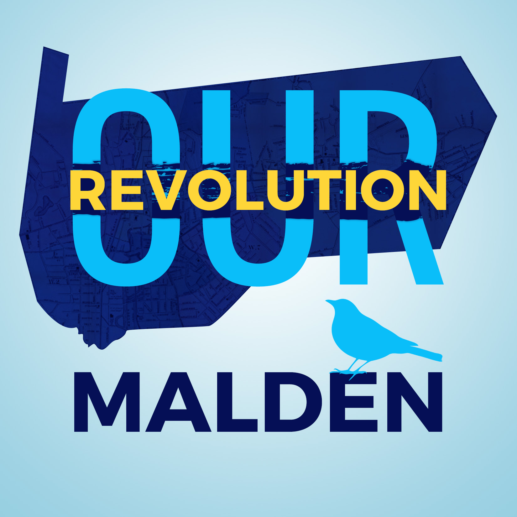
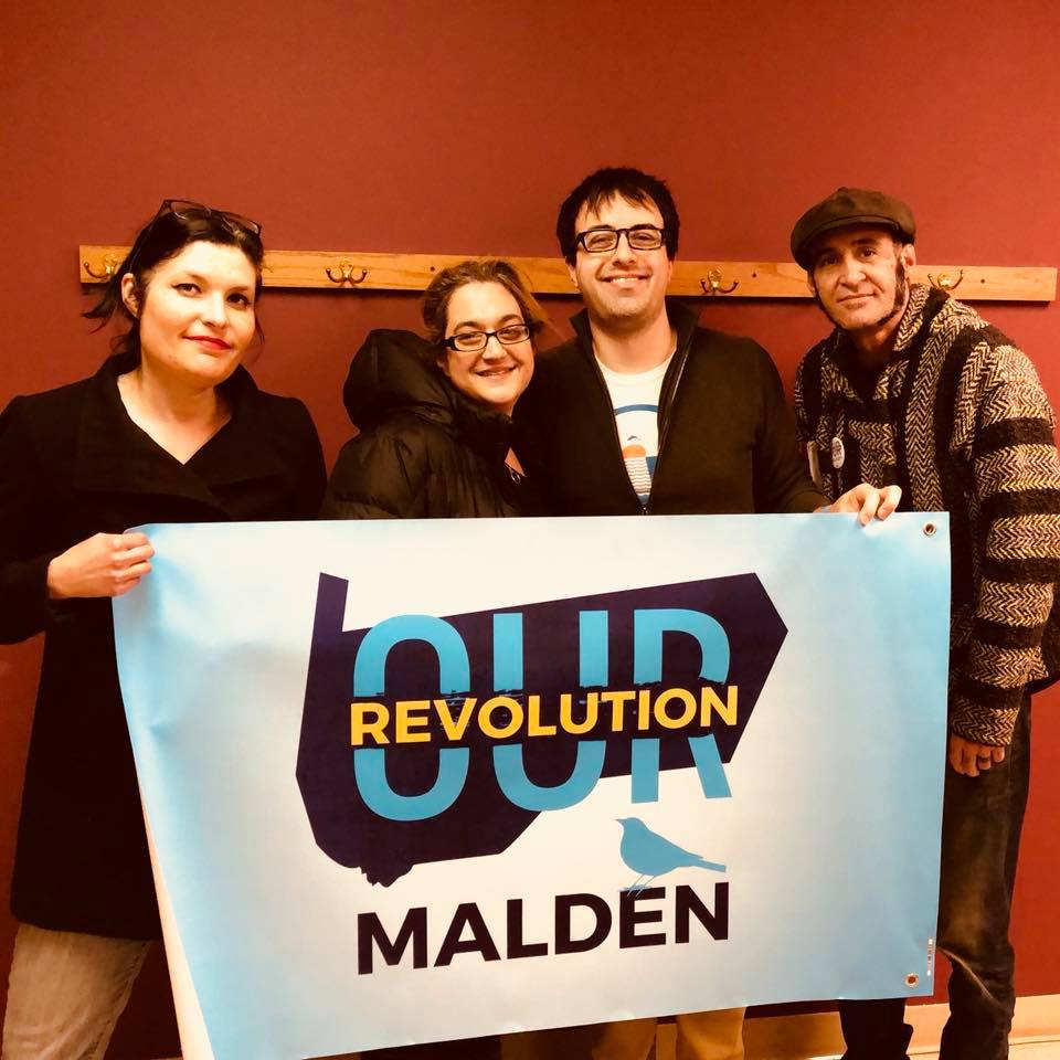
Our Revolution Malden is a progressive political engagement group based in a small city just north of Boston, Massachusetts. They needed a logo that spoke to the hyper-local focus of their efforts while echoing the aesthetic of the state and national level organizations, and evoking some of the emotional impact of the Bernie Sanders presidential campaign.
The Logo
The three colors I chose for this logo and brand were a dark blue, an aqua, and a bright yellow. The local public high school colors are dark blue and yellow or blue and gold, which made this palette a no-brainer. The fonts used to recreate the “Our Revolution” name are Oswald and Montserrat, one of which is an exact match. (Recreating the base logo from scratch is an Our Revolution tradition, looking at the ones other cities and regions have devised for themselves!)
The background shape is the outline of the city of Malden, with an overlay of an old streetmap. This shape left some dead space above the city name, and I decided the best move was to “put a bird on it,” as the liberal northwest joke goes! One special moment during the Sanders campaign was when a small bird perched on the Senator’s podium as he spoke, so I thought this cute little touch was perfect both for the composition and the historical foundation of the group.
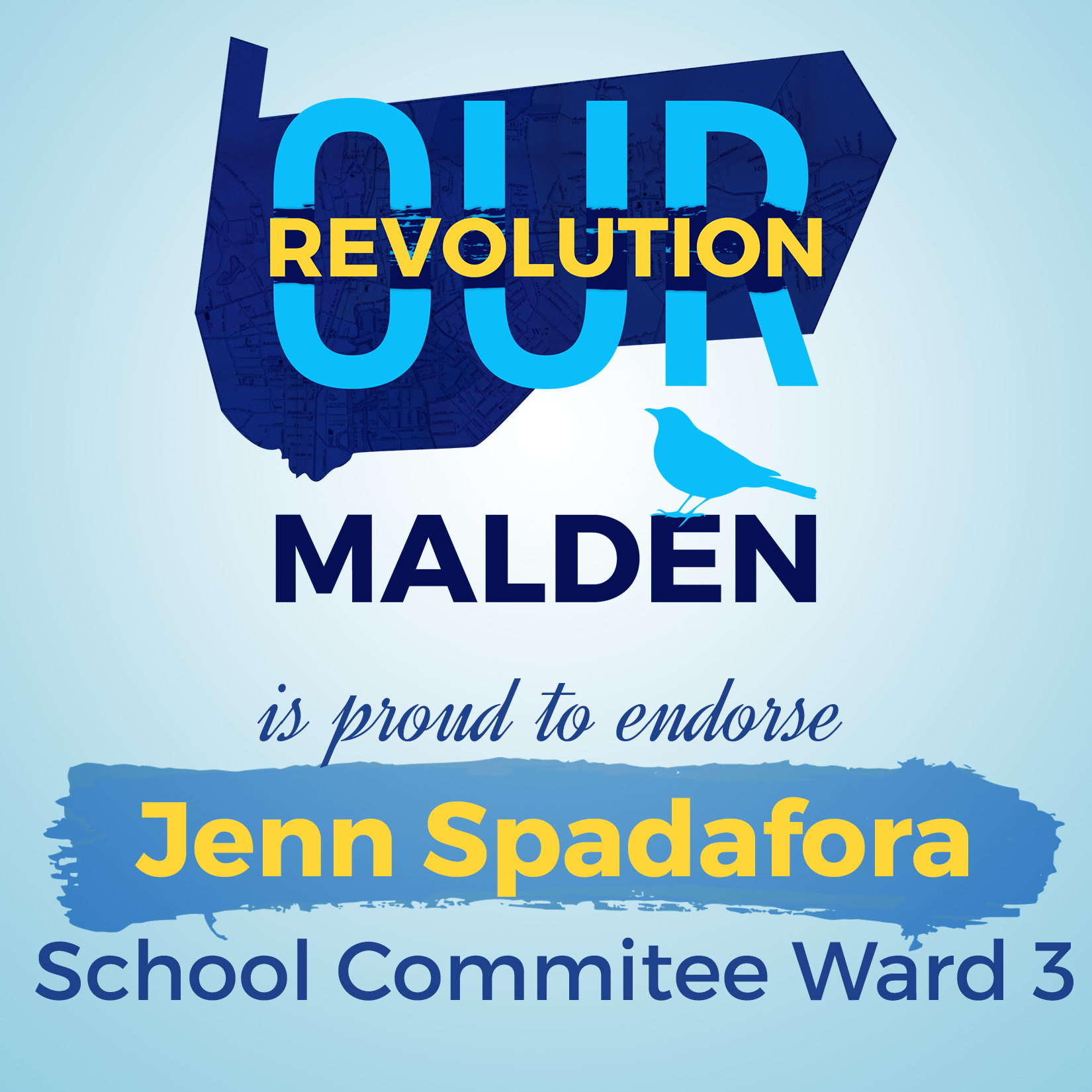
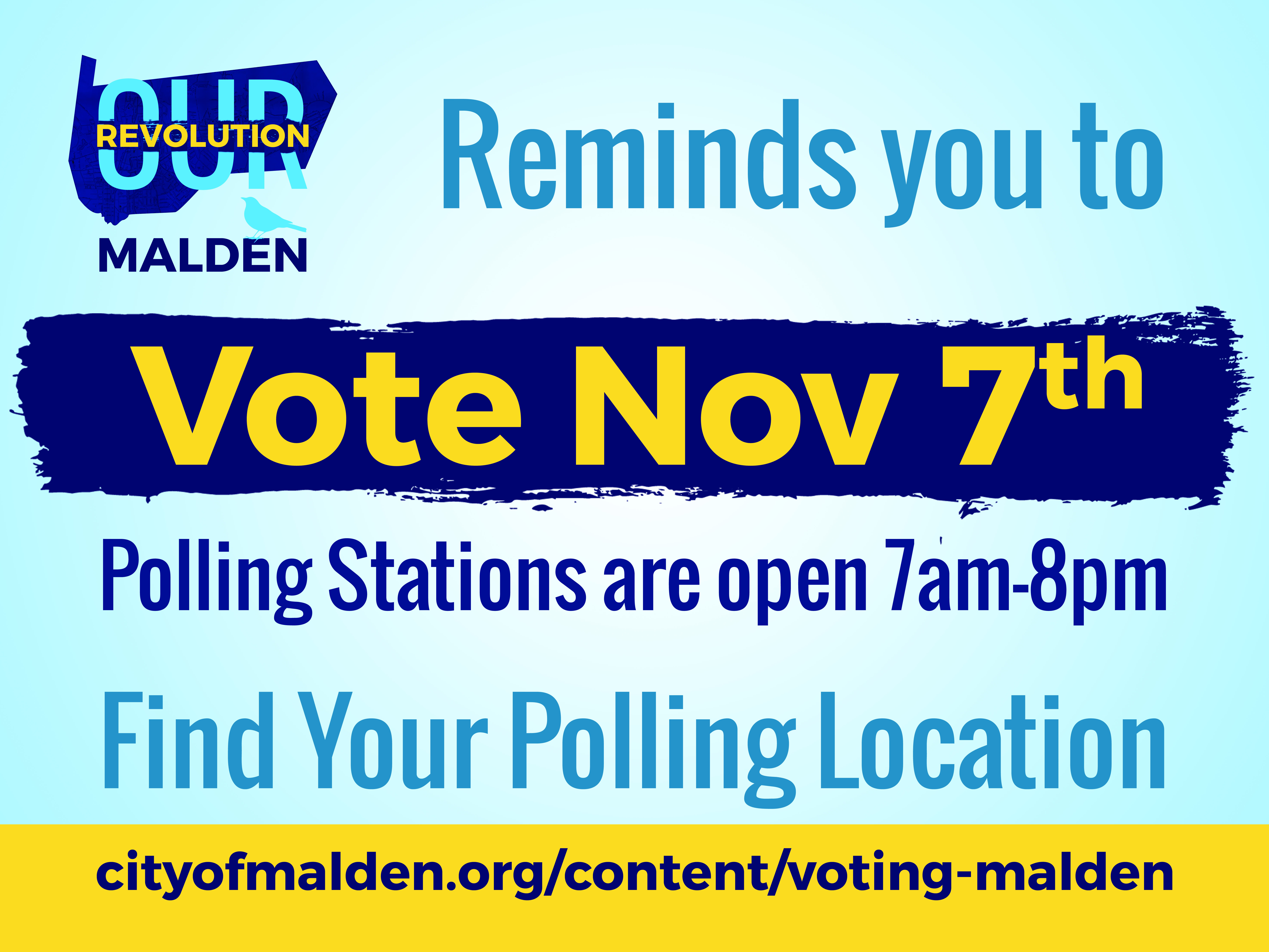
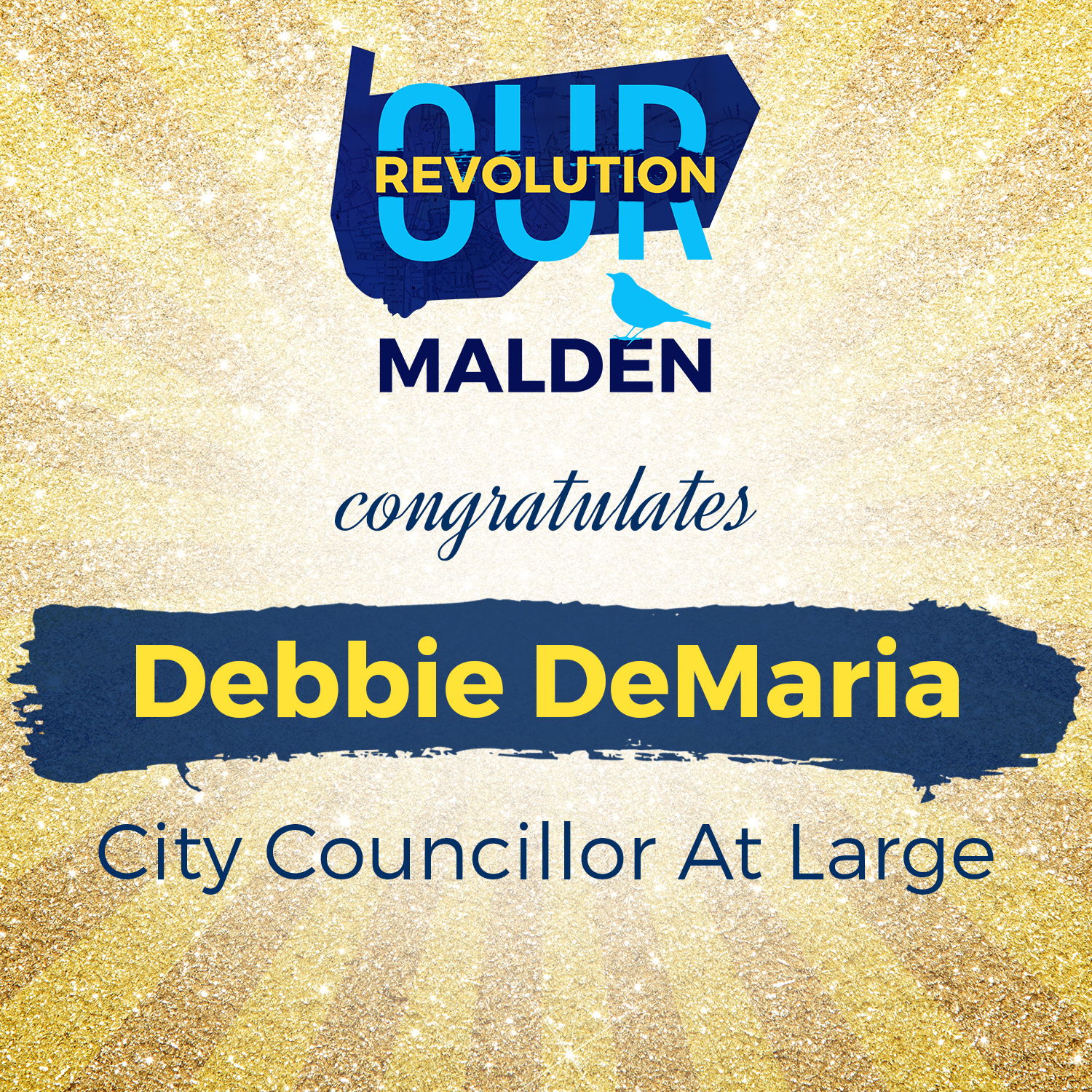
Social Sharing Images
Like most political action groups this one hit the ground running, facing their first local election cycle mere months after the first meeting. They needed images to advertise their endorsed candidates, remind their members and friends to get out and vote, and to congratulate the endorsed candidates who won their elections.
I used the same gradient background for the GOTV and endorsement images as the logo, but for the congratulations image I wanted something that stood out a little bit and felt more celebratory. The gold glitter and faint rays do a great job of changing up the image to express a different feeling.
The Banner
I got excited and had some credit lying around at a print on demand store that was going to expire, so I threw together a banner for the group! It uses the same image as the logo, but to print clearly I needed to recreate it at the right size. Designing for print is always tricky, but it’s worth the effort when you see your creations in the real world.