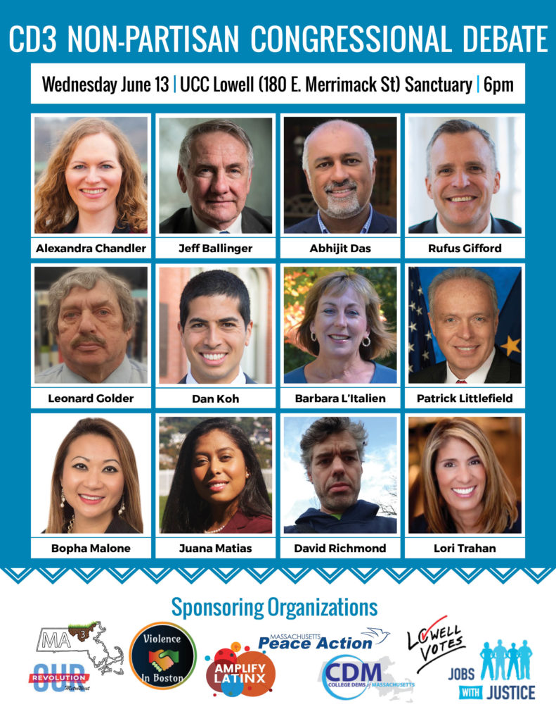
So, this is kind of a minor image, but it really took a lot to pull together. Massachusetts’ 3rd congressional district has no incumbent running in 2018, and the field is huge. This image needed to include twelve headshots for the candidates participating, and that was with one cancellation! I also needed to include the logos for all eight co-sponsoring organizations, the time and place information, and a title. All that, without getting cropped in a Facebook post.
I went with Oswald for the title text. Normally I would have used Montserrat throughout, but there was just no room for anything other than a condensed font in most of the text areas. The shade of blue I picked more or less at random, and then was the exciting task of placing headshots and names on an extremely tight grid (here’s where I could use everyone’s current favorite political font). For the border between the candidates and the organizations, I fussed around a bit before settling on an inline zigzag. The white bottom serves both to visually separate the sponsors from the debaters, and gives their logos a neutral background to work on.
Some days it astounds me just how much work goes into every little piece of how the world runs.
